Red/Green Colourblind friendliness when using dates to book online

When using the date picker for booking to visit a hybrid chapter as a red/green colourblind user it is very hard to differentiate between the In-Person and Online booking options.
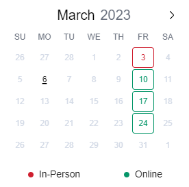
As per the attached the thin outline makes it very hard to see the difference in colouring. As a suggestion, if you wish to keep the red and green colouring, how about changing the background to red or green and the text to white. It is much easier to differentiate between block colours than thin lines.
-
Official comment

@nathan - Thank you for the suggestion. We have added this to our master list of feature requests for future discussion and consideration. We will add your request as a "vote" for prioritization. Hope this helps and have a great weekend!
Please sign in to leave a comment.
Comments
1 comment